

Internet use, especially over the last five years, has increased dramatically on mobile devices such as tablets, laptops and mobile phones. In fact, searching and browsing on mobile devices is now much more common than on traditional desktop computers. The latest Google figures state that mobile device usage now equates to over 60% of all internet browsing.
What does a responsive website mean to your business?
If your website is already responsive (also referred to as mobile friendly) and built correctly then that’s great, problems can occur if it isn’t and this can be damaging to your business.
Search engines, including Google, prefer to offer results to searches to websites that they deem offer a greater user experience. They don’t like showing results of poor quality websites or websites which aren’t technically built right.
Without a responsive website, Google doesn’t like offering these non-responsive sites in mobile search results. So, as you can see, if 60% of all searches are done on mobile devices and your website isn’t responsive, then it could be hurting your bottom line without you even realising.
FACT: If you search on Google on a desktop computer and then repeat the same search on a mobile device you may be shown different search results. One reason for this is that search engines prefer responsive websites on mobile devices.
E.g – let’s do a quick test and search for the term “gym in Mansfield”. Using a desktop computer, the first organic search result is Pure Gym. Doing the same search using a mobile device shows Xercise4less first.
So, to be competitive, your business website definitely needs to be mobile responsive to give you the best chance of being found when searching online.
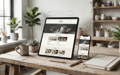
So, what does a responsive website look like?
Back in the day when mobile internet use was the new kid on the block, you had to have a ‘desktop’ version and a separate version of a site for mobile devices…honestly it was a nightmare.
Thankfully, things have moved on and have become a lot simpler meaning only one website needs to be built which ‘responds’ to the viewing device screen.
So, what do they look like I hear you cry!
Well, erm….. they look like websites, this is the entire point of them to work and look great across all devices. If you can view a website and it looks great on your mobile or on your tablet, then chances are it’s been built – mobile responsive.
There’s a lot more to it than that, but the principle is, If you can see images that look right and you’re not having to scroll around or zoom in and out on a webpage on your mobile device then it’s probably built correctly.
How does responsive web design work?
When building a responsive website, we use a fluid grid system. If your website has two columns for instance, instead of building it as a fixed pixel size, we say column one is 50% of the screen and column two is also 50%. So, it’s all done proportionally and not by fixed size. This makes your online content scalable.
If you’re viewing the website on a mobile phone screen we say, if the screen is smaller than x then stack the two columns on top of each other as opposed to squishing it all in column next to the other column. Other media such as photographs and videos will also scale in size.
So, are there any disadvantages to a mobile responsive website?
No, but they are more complex than building traditional non-responsive sites.
We must give extra consideration to the following areas;
Download speeds and graphics:
As you now have one website that responds to the device screen size we must take into consideration graphics and elements that could slow a site down. If your website on a desktop is filled with images or video then we may allow for a reduced content on the mobile version, no one likes a slow loading website.
How visitors use their devices:
With traditional desktop computers, users use a mouse to navigate and ‘click’ on what they want, on smart devices people select what they want using their fingers. This means that when planning the website design, we have to ensure that clickable regions and elements are clear and easy to interact with – there’s nothing more annoying than clicking on something and finding out you’ve selected the wrong thing.
Do you actually need a mobile responsive website or would an app serve the user better?
This depends on the kind of experience you want your visitors to have. All websites should be responsive but depending on what you need from the website, a dedicated app may be a great way to supplement to the website. Some of the most popular websites online like the BBC, AirBnB and TripAdvisor have dedicated apps specifically built to give the best possible functionality and enhance the user experience.
How easy is it to get a mobile responsive website for my business?
It’s easy for your web designer to do this, after all it is their job and they really should do this as a matter of course with any new website they design. The main issue is that if you want your website design to be responsive, you’ll have to start from scratch because responsive websites are built in a different way. There’s no easy ‘magic switch’ to turn your non responsive site into a responsive website. A fully responsive website adds prestige to your brand and the benefits it can bring to your business and online presence can be enormous.


0 Comments